An open space with an exhibition space focused on island areas that invites you to walk through it for a global vision around the product.
Year: 2023 Brand: ITALAMP
Euroluce 2019 / Milano
A space strongly characterized by the essentiality of the tops and the joints, in neutral colors, creates visual interest because it lets you explore the interior discreetly. In the whites and blacks the shapes stand out and the colors of the lamps are enhanced. It is always a more graphic idea to act as architecture for an exhibition purpose.
Year: 2019 Brand: ITALAMP
Euroluce 2015 / Milano
I design this booth with the structuralist idea that inspired the one for the 2013 edition of Euroluce, with a remarkable central volume, both for exhibit needs and for a greater attractiveness of the pavilion. The neutral theme of black and white, which has always distinguished the corporate style, is here proposed as a graphic must.
Year: 2015 Brand: Leucos
Euroluce 2013 / Milano
The idea for the Euroluce 2013 booth is very structuralist and focuses on three distinct volumes, representing three different product lines. The look is graphic and recalls the choice of black and white that was also used for the catalogue, also divided into three volumes for three different types of product. The central volume is necessary to simulate the wide spaces that house the large chandeliers, but also to have a visual grandeur in the exhibition hall.
Year: 2013 Brand: Leucos
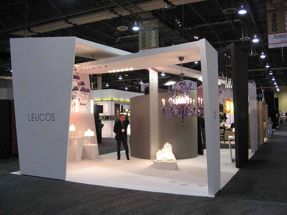
Hospitality Design Trade Show 2009 / Las Vegas
Because of the need to give the contents of the booth maximum visibility on all four sides, I imagine an ordered tunnel with a well-defined external surface, where to cut out organic openings to make the contents visible. Inside, a very strong graphic presence, in addition to the multitude of lamps that create interest.
Year: 2009 Brand: Leucos Award: Best Booth Award
Hospitality Design Trade Show 2008 / Las Vegas
The need was to create a booth that could be open and visible on all sides, given its small size, without giving up an attractive look. This was supposed to show the high-level design the company has in its DNA, and expresses in all its artistic forms. I use a technique I love to try myself in, that is the intersection of planes, which here totally break both formal and compositional orthogonality.
Google Analytics is a web analytics service provided by Google Ireland Limited ("Google"). Google uses the collected personal data to track and examine the usage of this website, compile reports on its activities, and share them with other Google services. Google may use your personal data to contextualize and personalize the ads of its advertising network. This integration of Google Analytics anonymizes your IP address. The data sent is collected for the purposes of personalizing the experience and statistical tracking. You can find more information on the "More information on Google's handling of personal information" page.